Figure Doodlin' Night - Episode VI Return of the Jedi

I am not nearly so arrogant as to call myself a "Jedi". It was simply the last time I would be able to use a Star Wars title. It's better than "Curse of Michael Myers" or "Jason Lives".

This week did go rather well though. So it is a return. Maybe "Return of the mildly competent".

My mark making was alot better than the last couple of weeks. I think so anyway. It was good to go home in a good mood this week.

So here ya go. Here's the shiny.

I think these were mostly 10 min. poses.

Figure Doodlin' Night V - The Final Frontier

Uhhh....I could probably tie that title in somewhere if I really put an effort into it. The truth is, there are few movie franchises that have gone to 5 (without rebooting). I'm going to be in trouble in about two weeks. I'll be down to  Harry Potter and James Bond movies.

I will also spare you, my banal bitching about my drawings this week (Like how I still fit it in a little bit though?)

They are what they are. I would have preferred better, but I think that will happen until I die. So I might as well quit bitching about it. At least until later this week.

We missed a week for spring break, these are from the week before that, when I was being lazy and didn't take pictures before I left the studio. Confused yet? Probably not, because I'm talking to myself here.

Here are the shiny things

An excuse to do Star Wars

Lyssa - A young female human wizard with black hair who always wears white trimmed in gold.

That was the description, and the only restrictions for yet another ArtOrder contest.

It was wide open, and the history of the project from Scott Taylor at Black Gate Magazine was a huge draw for me. I actually read Black Gate Magazine and had read all of the entries for Art Evolution.

If that wasn't enough motivation, one of the one of the judges, Jeff Easley, was one of the reasons I got into art (and D&D for that matter). I still like looking at his images. His stuff from Dragonlance is some of my favorite work by anyone.

 Also judging the contest was Todd Lockwood. His work is everywhere. He is one of the most popular fantasy artists working. His work is great, and once again...you guessed it, I'm a big fan! It's another guy that I study to try and improve.

Ok, on to the project.

I normally try to give myself restrictions on each piece. Otherwise my brain starts going haywire and I can't make a decision. This usually ends in a nap. I had no time for naps though.

So if you look back at all of the great Lyssa's done for BGM, most of them were fantasy types. Wizard is a keyword that just brings fantasy to mind first. Not all of them were fantasy, but the majority were. That lead me to the first restriction I gave myself. No fantasy.


My 2nd restriction was the attitude of the image. I didn't want it to be a pin-up or have the concept art character development feel. I had a feeling alot of people would be going this direction. So no half naked, hot chics with a pretty face.


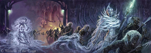
Now, whenever I think of  a character in white, the first thing I think is clean and holy. A healer type. Not my Lyssa.

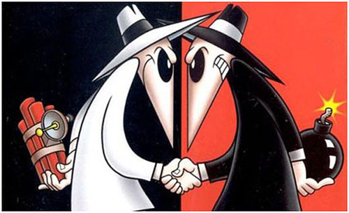
Look at some of the bad guys that have worn white. They seem that much more sinister. Stormshadow, Stormtroopers, Boss Hog, the "Man in White" from family guy, and obviously the White hat in Spy VS Spy.

So I reached out to the nerd collective (my friends) for different "wizards" in different games, books, movies, etc.. As soon as I heard the words Star Wars, I knew I had my Lyssa with the Nightsisters

The Nightsisters were a group of Dathomiri Witches (usually exiled from one of the other clans) whose magic was powered by the dark side of the Force. Not to mention they use a Light Whip instead of a Light Saber. How cool is that!?

I did some research, reading up from gaming manuals, watching Star Wars The Clone Wars, and reading excerpts from books. That was rough. I mean, reading and watching cartoons!? Just pure torture!

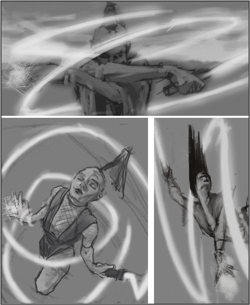
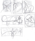
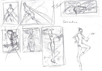
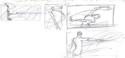
So on to the thumbnails. I got some opinions from the studio mates and cut them all down to three that I worked up a little more. The one looking down on Lyssa was too "serene" for me.  The last two were in a tie until I held someone at gunpoint to make a choice. Just kidding. It was knife point. I can't afford a gun. Still kidding. I bought them a sandwich and begged. I'm pitiful.

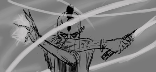
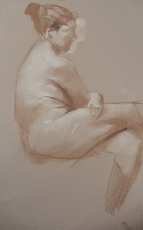
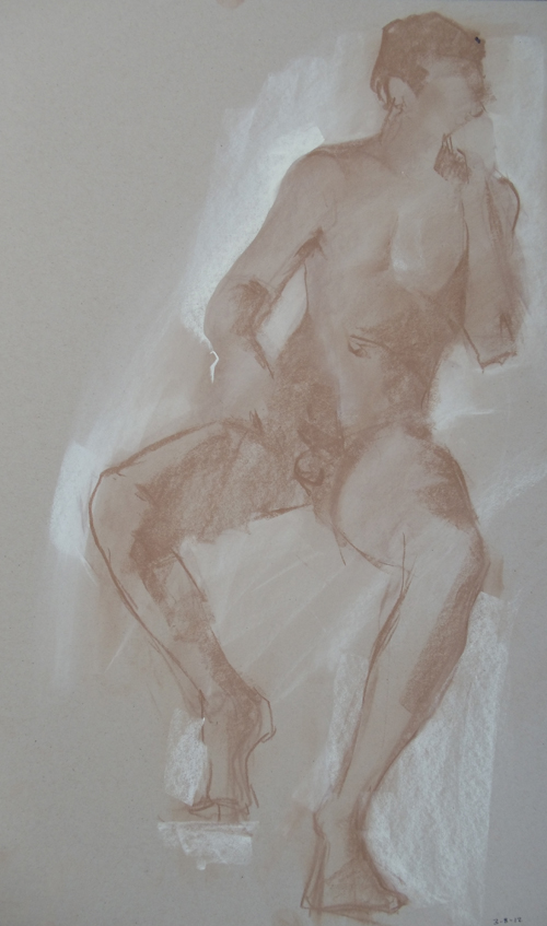
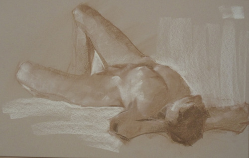
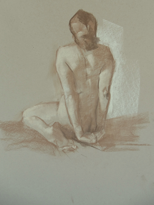
Once it was decided, I shot some quick reference of one of the studio folk. I got out the tracing paper and started working up the drawing and her outfit.


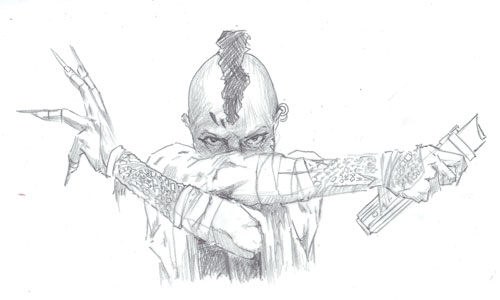
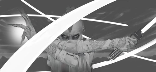
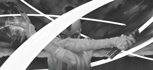
When the drawing is pretty tight, I scan it in to Photoshop and start adding some values. (I obviously didn't notice her eyes were all jacked up)

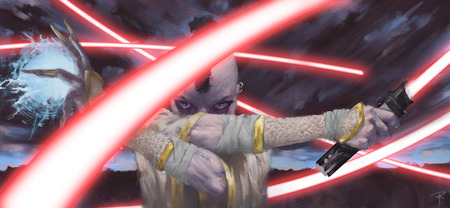
I explained before how I add color. However I usually try to have a direction instead of just blindly adjusting colors. I look at "those that have gone before" (say that in James Earl Jones voice...Epic!) to see how they handled a similar painting with a similar mood. This one was dictated so much by the whip having to be red, and the clothes being some form of white. I just had to make the rest work.

After I have the color pretty close to what I want, it's on to Painter. I like using the brushes in Painter for the final mark making and blending and such. It just adds a touch that I like that makes it look a little less digital (hopefully). I also like using the paper libraries. I've been experimenting with those more and more.

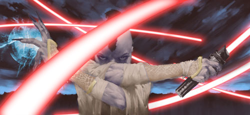
Oh, and the light whip shapes were just vector shapes with some fx thrown on.

And now, how do I promote a Star Wars painting?

"Check out the Star Warsing Star Wars I just Star Warsd! Star Wars is so Star Wars, that I was just Star Warsing all over the Star Warsing, Star Wars. Star Wars!"

It's like filling out a Mad Lib with just the words Star Wars.......I'm an idiot.

Figure Doodlin' Night - Episode IV - A New Hope

Like

I wasn't

waiting for

the chance to

do that title since

I started this stupid

string of titles. How does

it apply to this week? Uhhh..

I thought this drawing was horrible

last night. I thought I wouldn't have anything

to post today, because figure drawing night did

not go well for me last night. (You will soon find that

I say that every time, but this time I really mean it. Seriously.

I do. I'm not kidding. No joke..Really....I couldn't be more serious...

stop looking at me like that) I took a picture of the only drawing that

was even recognizable as a human figure, and went home feeling very

despondent. This morning I loaded up the shots of last nights drawing. As

I looked at it for awhile, I realized there was.........wait for it..........................

A New Hope!

*a cheer goes up from the crowd*

It doesn't make me want to cry and break my own hands. Yep, that was a very

long way to go for a really crap joke, but if you can't tell; I'm doing this to entertain

myself, more than you. Now on to the shiny! 15 Min. Pose - NuPastel on toned paper.

Was that funny? Not really. Was it hard to read? Certainly. Does it look more like a christmas tree than the original Star Wars scrolling text? Unfortunately. Do I care? Nope. I was giggling to myself the entire time. Have a good weekend!!

Figure Doodlin' Night III - The Search for Spock

How old is that dumb ass joke? I'm going for the Steve Martin thing. I'll just keep using it until the fact I'm still using it, becomes so ridiculous, it's funny again. That should be about a year from now.

Anyway, things didn't go so horrible last night.  I have two whole images for you to look at! Wee! Aren't you all excited. They aren't perfect by any means, but there are things I like in them. I'm not telling you what though. Tee hee!

Yeah, all right. Enough blah blah! Here's the shiny stuff.

The first one is pretty rough, but there is something I like about that.

These are both 15 min. poses.

Figure Doodlin' Night - Part Deux

As with most sequels, it's not as good as the first. Fortunately there isn't far to fall.

Only one image was worth looking at for any amount of time. The night as a whole was just a big hot mess. So if you squint, and click away real fast, this one looks pretty good. I will try to do better next week, please don't hit me! I'll do better, I promise!!!

20 minute pose

Figure Doodlin' Night

Figure drawing started up again at the studio......We planned it. It wasn't like a flash mob. Although, that would be interesting. All of a sudden a bunch of people bust out some newsprint pads and charcoal sticks. Some woman (or man) shucks some velcro clothes and jumps up on a flower pot, conveniently close to a street light. "Let the gesture studies begin!" or "Oh Shit! The cops!"

Anyway, enough random blathering. These were all 10-15 min. poses.

I plan to post these after every Thursday night drawing session.  Hopefully we will see some improvement over time. Then we can come back here to the first posting and laugh and laugh at the silly way Aaron drew these (or the fact I can't seem to fit them on the page).

There is a new painting in the works, that has to be done by Sun. night for a contest. So there will be a gallery update next week. Wee! I know we are all excited. (Someday the internet will figure out how to convey sarcasm in type.)

Cool Sh.....tuff.

Taking a break from the narcissism.
My friend and studiomate Leslie Herman is part of a show at Ghostprint Gallery.

It starts tonight, and goes until the 25th of February.

Leslie is a gold medal winner from the Society of Illustrators show this year. For those that don't know, that is about the top of the heap for Illustrators.

It's a great show. Do yourself a favor and come check it out.

Bucket O' Thumbnails

Taken out of context, that title sounds disgusting.

What it really means, is that I did an endless amount of thumb nails for this piece. These are just a few pages of them. It's worth it in the end, but sometimes........sometimes.....

I had quite the struggle coming up with an idea I liked. I obsessed over it for a couple of days. Still nothing. Obsessed a few more days, and yet, still nothing.  Cried in the corner of the shower, drank several bottles of hard liquor, and punched myself in the face once or twice. Still nothing.

The problem I was having, was coming up with something unique. All of the old pictures seemed to be of the same scene in the book, or the "Frazetta" pose. Not that there is anything wrong with any of those. I just wanted to do something different.

Then, just as I'm about to give up......VOILA'! An idea that I was kind of excited about.

The general concept that got me to this point was tying together the idea that Carter was a soldier on both Earth and Mars. I wanted the silhouette to be one person. Yet the two sides are different (obviously).

I made the gap for the sword larger. I wanted to make it obvious that it was supposed to be "split", not just bad drawing.

After I have the reference done, and the details worked out I wanted a pretty tight drawing. I have to draw everything out to understand it. Then I go back in and block out the unnecessary stuff. I love paintings that looks so detailed that it is nearly realistic; yet when you look closely, it's just some pockets of detail. Your mind is filling in the rest.

Working out the values.

I usually work out the image in grayscale, then add color. I learned that from watching a Jon Foster demo at Illustration Academy. I can't say that it was my idea. I've kind of changed the overall process, but the idea is the same. It allows you to sneak up on the color instead of being overwhelmed by it. You can also experiment more and possibly find something that you wouldn't have thought of.

Tighten up the painting. Adding the "painter" flourishes.

Just about done. I made some color adjustments. It was a little too cold. I also added the original pencil drawing to the top of the painting. I lowered the opacity and erased alot of it. I left just enough to add some interest, and texture. If you look closely at the large image in the gallery, you can see it in the shadow areas.

Cowinkydink!

Yes, it's a word. Sort of.

Strange coincidences are always fascinating. I made this picture at the Academy this year, because I had some extra paper, and I had been wanting to do a Natalie Wood piece.
I had no idea that this year, on November 29, would be the 30th Anniversary of her untimely death. Not only that, but this would be the year they re-open the investigation of her death. It just seems crazy to me.

Yes, I'm kind of in love with Natalie Wood. A timeless beauty, my friend.

Seriously!! Look at those eyes!

No glitter or teen angst....

Let's face it. Vampires are f'n cool. Even the glittery teen ones in the books and movies, that I haven't read or watched. Ok, so they appeal to some people.  And those people think they are REALLY cool! Seriously, they are obsessed....uncomfortably. Alright, that's enough of my thinly veiled insults. (I'm just teasing! No angry emails!)

So, I wanted an old school vampire. The old Count Dooku....uhhhh...... Christopher Lee type. Nicely dressed, big cape, suave mutha #*@!

I decided to focus on Strahd, from Ravenloft. The story was pretty cool and slightly different from good old Dracula. I wanted to do something kind of conceptual, not just a cool guy in a cape.

These are the early, early ideas. Just putting things down as quickly as possible. This is just a couple of the pages. I do alot of thumbnails. Every time I think I'm too rockstar for that, the image doesn't turn out as good as I think it could. Sometimes, I nail it with the first sketch. More often than not though, I will find something better by pushing it until I'm out of ideas.


Once I have a couple of ideas I think will work, I flesh them out a little more.

I decided to focus on the Tatyana aspect of the story. After all, it's why Strahd became a vampire, and her reincarnations consume (get it? consume? ba dum chh!) alot of his free time.

So anyway, I gathered some reference and some inspiration.


Got some feedback from the studio mates. Changed the layout a little.

I drew out a bunch of different screaming women on tracing paper. Scanned them in seperately so I could arrange them inside the cape.


Want to know a benefit of working in a studio with other artists? Check out that head. I may have noticed that he had a little squished head, before I called it done. More than likely though, I would have noticed it a couple of days after I showed it to the world.

Re-arranged the faces, and made some color adjustments. Tightened up his face a little, and then called it done.

I just wish that I could claim that I planned this antithesis to Twilight so perfectly. That would be some genius planning. Just dumb luck though.

The new bouncing baby.....painting

I wanted "Bad Ass"! I wanted her to look like she's been drug through hell and is going to get up one last time, just to kick YOUR ass.

(Unfortunately I can't find the sketches, so we will start further into the process.)

Took me awhile to get the idea down. A very long while. I have a hard time when I don't have time constraints. I keep second guessing, going back, re-doing old ideas, etc.

I also have a problem with not zooming in. I'm not talking about zooming in and working every little tiny detail. I'm talking about zooming in to the heart of the picture. Get in there and let the viewer feel like they are involved. I always want to keep moving out to add more elements to the piece. I have to force myself to crop and move in, "trim the fat". I was trying to go overboard here. I still think I could have gone farther, but I'm generally happy with it.

Tried some new techniques. Basically some watercolor brushes used as stamps. It wasn't a complete success as far as I'm concerned, but I learned some things that worked and some that didn't. The thing with digital is that I each time I learned someting, I had to force myself to keep going forward instead of going back and applying what I just learned.


and.......VOILA!!

Cleaning the morgue

When I was in college, there was no Google image search. If there was, I didn't know about it. You had to take your own photos or find some in your morguefile. I started keeping a morguefile while I was a freshman in college a long, long time ago. I eventually became lazy, and just started keeping the entire magazine. Believing that someday when I needed that picture, I would remember where it was, and that I would go find it.

Enter Google image search. Remember how I mentioned that I was lazy? Well it comes into play here again. Why go dig out my years old morguefile, when I can just "Google It"? This is where I show some other vices. Stubbornness, and (mild) hoarding. I still have that morguefile, and collection of magazines.

So....It came time to start packing for the move. I wanted to "cut weight", as they say. However, I didn't want to just throw away the morguefile and all the magazines (hoarding).  Luckily, I had an epiphany. I will just consolidate all those pictures, and cut up those magazines and put them into a sketchbook. I don't really need a morguefile anymore, so I will make all of that stuff into more of an "inspiration book".  It won't take much time (wrong), it will be an interesting project (true), and will cut down on another box for the move (Ha! Bullshit!).


This will apparently be a much longer project than I planned. I have kind of started organizing the sketch books into subject matter, but I'm not being too strict about it. I want more of a randomness to the images. You never know where your inspiration for an image will come from. If I had it too strictly organized, I would never stumble on to the obscure idea that someone else may not have thought of.


Yeah, I know. It's kinda like scrap booking. Without the glitter, stickers, and awesomeness.

My unnecessary two cents

Sometimes, technology revolutionizes how we do things. It makes a job simpler, or does it better. Other times.......uhhh....well......

So tell me. What does this do? More to the point, what does this improve upon?

The pen? Scanning technology? Does it make the job simpler?

I doesn't appear to significantly improve any of these things; yet.

Right now it's more of a "Look what I can do!" gadget. It's neat. That's it. (I could be missing something though. It's been known to happen. *Gasp!* Yes, I know. Shocking.)

However, what I am interested in, is where this is leading. This is the opener. To work out the kinks. What's next? Digital chalk boards for teachers with a traditional classroom and an online classroom? Combined with cloud technology to allow you to make notes and sketches and instantly have them sync with your computers and online storage? Sketch straight to your blog? Do a full tonal drawing for your painting and have it instantly be saved to your computer. You now have your traditional piece and a digital piece saved with no scanning or photos. Completely merging traditional and digital. Make an oil painting that is saved digitally as you go? So much for software imitating traditional tools after that.

Alot of great possibilities, but for now I'll stick to my traditional pen and pad.


Sometimes you just gotta say.....

"Sometimes you just gotta say.....What the f#*k. Make your move." - Tom Cruise - Risky Business

I've mentioned it here before. I'm moving. Most of you didn't know. Most of you don't care. However, there are one or two people that do. This also somewhat explains the lack of art updates. Have no fear. They are on the way.

Where am I moving?: Hampton, Virginia  I will be sharing an apartment with a longtime friend.

Why am I moving?: Artistic community - I will be spending most of my time in the TAD studio in Richmond. I will be around other artists that inspire and motivate me. Being within shouting distance of artists that you admire, and being able to ask their opinion on your work is invaluable.  Not to mention they are great people and fun to be around.

A change - Yes, I'm leaving a full time job with benefits. Tom Cruise said it best; and it is that time in my life and my career to make a move.

Do you have a job there?: Yes. My portfolio. That will become my full time job. I will get a part time "joe job" to pay the bills and put some food in my stomach, but the focus will be on improving my art and developing an Illustration career. I have been preparing for this for over a year. I already have my survival money squirreled away.

Who are the artists?: I could sing their praises for awhile. I'll spare you my fanboyishness (yep, that's a word), and just leave you some links. You can check them out yourself.  Sterling Hundley, Josh George, Jeff Love, Edward Kinsella III - There are more great artists in the studio, these are just a few.

There ya go. Any other questions, just ask.

Packing all of the important stuff. I may have to leave some clothes behind to make room for my books.


OMG! It's flying at my face!!


If you have me on any of the social networks, you have probably already seen this. I just had to post it here. What a great video. In fantasy illustration, there are endless creatures that have wings. You need to know how the wings work in order to paint them convincingly.
This is a great video for screenshots, or just pausing. A straight ahead view of an owl flying right at your face! Pretend it isn't an owl. Maybe it's a dragon, or a harpie, or maybe.....wait for it...... A GIANT OWL! Oh no!
There are several addons in the Firefox browser that let you download flash movies (I use this one}. Then I use VLC to watch most of the movies on my computer. It has a handy little screen cap button. So you can watch the movie for the shot of the wings you like the best, then pause, and screen shot.

I think most any video player will probably have screenshot capability. VLC is just the one I use.

What a little time will do

I spent all weekend working on this site. Making graphics and backgrounds, fixing the layout, etc. Now that I have had a day away, I realize that the "rust" looks more like blood. Yeah. That's a little much. I'll have to fix that.

Decisions, decisions...

 I can't seem to make a decision.

I've been thinking about this for awhile. I wanted a logo/signature that I could use for branding. I've had this design running through my head, and been using some version of it for my signature on my paintings. I figured it was time to take steps to finalize it.

Most of my work right now is digital. I wanted a traditional feel to this. I wanted the spontaneous, quick stroke, "signature" look. Like it's a natural signature. I figured no better way to do this than sit down with the paper, ink, some pens, and some brushes. Everything was done using bottled ink. No bic pens.


I did a ton of them, trying different strokes, speed, etc... I then collected all of the pages and scanned them in. I went through with Corel Draw and cut the ones out that I thought looked ok. I exported each of those as jpegs and loaded them into picasa, then made the little movie above. Picasa makes that amazingly easy.

The slide show is just a feature in Picasa's web albums. Damn those Google products can be handy. You can also make slideshow movies that you can upload to your web albums and youtube, right from your Picasa on your computer.

I am going to decide on one of these soon. You are welcome to help. I've numbered each one of them so you can tell me if there is one you prefer. Most are pretty similar, just small differences. It's only a little more than a minute of your time. I know; that's asking alot in this internet age.