This piece was a nightmare.
I went through my process like any other piece. Thumbs, sketch, better sketch, etc.. Then I started working on the finish and quickly realized that my masterpiece was not going to work.
A problem (definitely not the only one) was that it's hard to let go of ideas you already have.
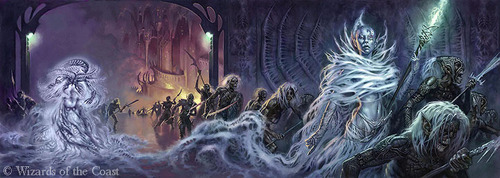
So, we will start with the story. I wanted a World of Warcraft piece. I used to play the game. As far as addictions go, it's up there with smoking and drinking. Just doing the research was enough to make me contemplate loading up the game again. Which of course would lead to the wonderous bliss of gaming life. No showers, heart attack inducing amounts of Diet Mt. Dew, and alot of Red Baron pizzas. Sounds wonderful, I know. But, I digress...
I wanted an iconic event of WOW (learn the lingo, noob!) One of those instances that everyone talks about being so much fun. Again, I went to the collective nerd brain (my friends). The one event that was mentioned multiple time was Karazhan and the "Opera Event".
So without completely nerding out and explaining every last detail about the event........Your group enters the opera, and the evenings show is announced. There are three "plays" that can happen at this point. Hood, Oz, or Romulo and Julianne. I think you can figure out what stories these are based on.
Here is a little video for you to watch, if you are interested. You can even hear them talk in that foreign gamer language. Karazhan Big Bad Wolf
The "play" that everyone remembers is Hood. So obviously (oh of course!) the point is to kill the Big Bad Wolf. While you are in the process of trying to do this, the BBW will yell out, "Run away little girl, run away!" and turn someone into Little Red Riding Hood. That persons only option is to run like the wind, or be squished like a little red bug.
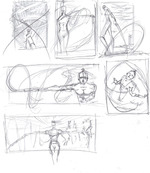
So how to tell this story in one image.....
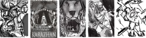
I liked the poster idea above, but it didn't have the action that I thought was fitting.
I decided on the big action, dramatic pose, with red running around in the back.

So the sketch was done, the line drawing was ready to start painting. I'm a genius! This will be epic! I'm L33t!
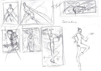
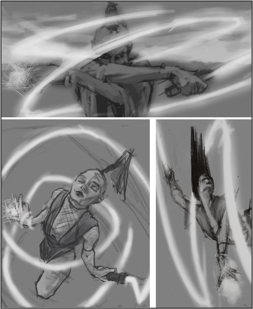
I started working on the grayscale. I quickly (not so much) realized that this wasn't going to work. The cut out house didn't work. There needed to be something in the foreground. My drawing was horrible. To name a few things.
These should have been relatively easy corrections. However, I am a dedicated man. Dedicated to making things as difficult as possible for myself.
Ok, so we will throw in a dead "Tank" in the foreground. It will add to the drama. Red is in some serious shit without anyone to protect her. Here is where I should remember the words of William Faulkner. "Kill your darlings". Meaning, have the courage to get rid of the elements that you love so much yourself, but that don't really add anything to the whole - or, even worse, actually weaken it.

That dead body wasn't going to work for me. No matter what pose I put him in. As you can see, I tried and tried and tried and tried........and tried......

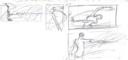
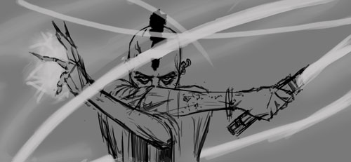
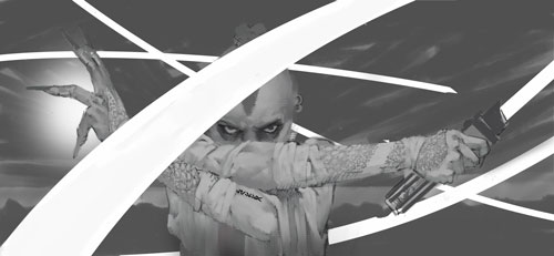
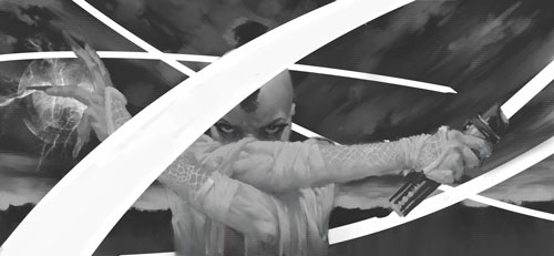
Finally, I got it through my thick skull and went for the standing pose, getting ready to take on the BBW.

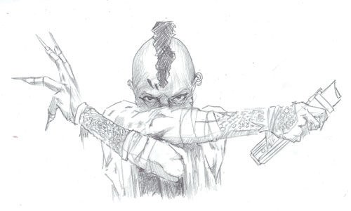
Finally at this point, I thought I was home free. Just add the color and finish up. Oh, if only......
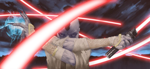
I was trying to use the WOW palette that they used in the game. However, I didn't really set up my value structure of the image to fit this quite right. I grew progressively more frustrated with the colors. This lead to the very simple palettes that I tried with the black and red. I didn't want to do just the greyscale image with spots of red. That seems to be everywhere right now. Seriously, go to a Gamestop, and look at the video game covers. It's popular. I tried adding just a little blue. Ugh. Nope.

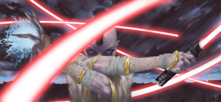
Finally, I got something working. After discussing it with Sterling and the rest of the studio, it was decided that it was too chalky and the palette was all over the place. Hence, the warm wash. Not only did that help the palette, but it also added some atmospheric perspective to add depth between the BBW and the Warrior.

A few adjustments and we have the image at the top of the post. TA DAA! It really is magic!
So the moral of the story? Sometimes you do everything you are supposed to, take all the steps to a successful image, and it still doesn't work. You have to learn to roll with the punches. And kill your darlings. Kill them with impunity! Die! Die! Die!........I'm still working through some of the frustration.
I should have gone with my friends idea. A pile of dog crap on a stage, with a little piece of red cape peeking out. Simple and elegant.